Your customers in Kuwait browse, compare, and buy on multiple screens—often starting on a phone and finishing on a laptop or tablet. A responsive website adapts to each device automatically, so every visitor gets a fast, usable, and trustworthy experience. We design professional, user-friendly websites that fit your brand and goals while performing flawlessly across mobiles, tablets, laptops, and desktops.
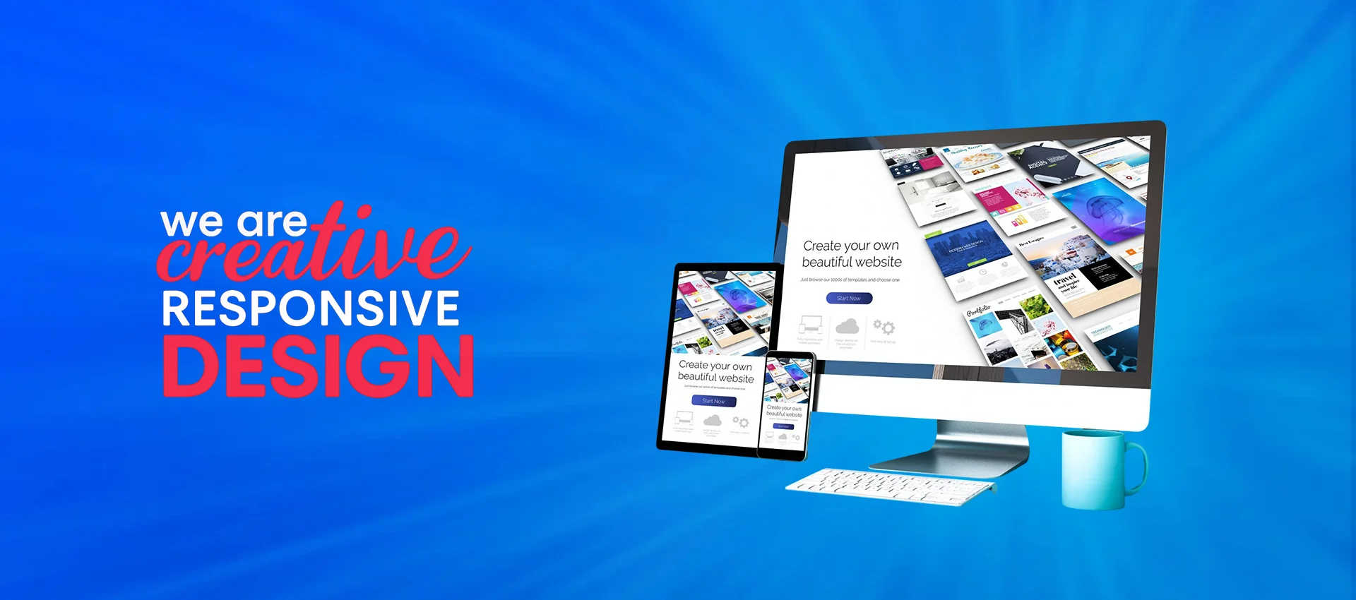
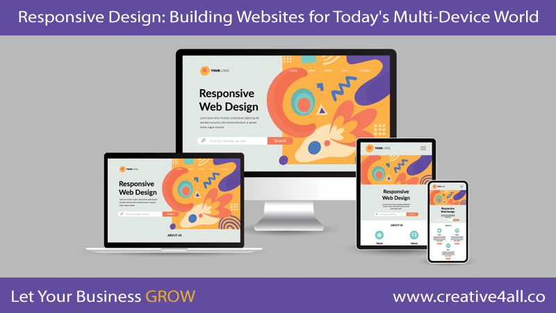
Responsive Web Design (RWD) means your layout, images, and content intelligently adjust to the size and orientation of the screen. Instead of maintaining separate “mobile” and “desktop” sites, one codebase responds to the device in real time. The result is simpler management for your team, faster delivery of updates, and a consistent experience for users—no pinching, zooming, or broken pages.
Why Responsive Matters in Kuwait
Mobile traffic now represents the majority of web usage globally, and Kuwait is no exception. Shoppers, parents, students, and professionals rely on quick, clear mobile experiences to make decisions. If your site loads slowly, forces extra steps, or hides key actions on smaller screens, users will bounce and competitors will win the click. A responsive, mobile-first build gives you broader reach, better engagement, and more conversions—without paying twice for development.
Beyond convenience, responsive design supports the essentials of growth: stronger SEO, higher ad quality scores, and better analytics. Search engines reward sites that are fast, secure, and mobile-friendly. Paid campaigns convert more efficiently when landing pages load quickly and match the visitor’s device. With the right structure, you can measure behavior across screens and keep improving week after week.
Who Needs a Responsive Website?
If you want maximum coverage for your business or service in Kuwait, you need a responsive website. From local retailers and restaurants to clinics, real estate firms, schools, and e-commerce brands—every organization benefits when users can browse and act comfortably on any device. Whether your audience prefers Arabic, English, or both, responsive layouts ensure content remains readable, buttons are thumb-friendly, and forms are easy to complete.
How Kuwait’s Mobile Users Browse
Mobile usage keeps rising day after day. People research services, compare prices, read reviews, and contact businesses directly from their phones. Many begin with a search, skim a few pages, then visit or call within minutes. A responsive site meets these habits with clear headings, compact copy, scannable sections, and fast paths to actions like calling, booking, or adding to cart.
Benefits of Responsive Web Design
- More mobile visits: Reach people wherever they are—on the go, at home, or at work—without compromising quality.
- Higher rankings: Mobile-friendly, fast pages improve SEO signals and discoverability.
- More revenue: Better usability means higher conversion rates for calls, bookings, and purchases.
Our Mobile-Friendly Approach
We build responsive websites using the latest techniques and proven patterns. Every decision supports speed, clarity, and action. From the first wireframe to launch, we test across common devices and browsers to ensure a seamless experience in both Arabic and English.
Four Principles Behind Every Page We Deliver
- Fast Loading: Lightweight code, optimized images, and modern caching keep pages quick on local networks. Speed reduces bounce and raises conversion.
- Viewable: Clear typography, generous spacing, and flexible grids ensure content remains readable on any screen size, portrait or landscape.
- Touchable: Buttons and forms are designed for thumbs, not cursors. Interactive elements have enough space, and errors are easy to correct.
- Actionable: Each page highlights a single next step—call, book, get a quote, or add to cart—so visitors never wonder what to do.
What We Include as Standard
- Bilingual structure: Arabic right-to-left layouts alongside English, with consistent terminology and mirrored components where appropriate.
- SEO foundations: Clean URL patterns, structured headings, meta fields, and sitemap generation to support organic visibility.
- Conversion design: Clear value propositions, trust badges, testimonials, and concise forms tuned for higher completion rates.
- Accessibility: Color contrast, keyboard navigation, and readable labels to help all visitors succeed.
- Analytics readiness: Event tracking for taps, form submits, and calls, so you can measure what matters and improve.
From Mobile-First to Multi-Device Excellence
Responsive design starts with mobile, then enhances for larger screens. This approach forces clarity: the most important content is shown first, distractions are removed, and actions are obvious. When users move to tablets and desktops, the experience expands gracefully with richer media, comparison tables, and advanced navigation—without losing speed.
What You Can Expect Working With Us
- Discovery: We clarify goals, audiences, and key actions to guide structure and content.
- Design: We produce responsive layouts that reflect your brand and make decisions easy.
- Build: We implement modern, standards-compliant code engineered for performance.
- QA: We test across popular devices and browsers to ensure consistency.
- Launch and iterate: We monitor results, learn from analytics, and refine over time.
In short, a responsive website is the simplest way to serve every visitor with speed and clarity. It adapts to the device, respects the user’s time, and turns interest into action. If you are ready to expand your reach, improve rankings, and convert more traffic in Kuwait, a responsive build is the right place to start.
